Generate Leads 24/7 with Landing Pages
Mar 21, 2018Whether you run a small business spending $10 a day on Facebook impressions, or a midsize business paying $5 per click to Google Adwords, you’ve probably had the experience of looking at your analytics dashboard and realizing how many of those dollars were required to secure one single prospect’s name and email address.
The problem could lie lots of places: your ad copy could be ineffective, or maybe you’ve misjudged your audience targeting and need to adjust your demographics. But if the appeal is there and the clicks are coming through, then we probably have a simple failure of conversion.
It’s one thing to drive traffic to your site, but what happens when the prospects arrive? Go to your site now and try to see it through the eyes of your first-time visitors. Are they overwhelmed by an array of tabs across the header that offer various rabbit holes to go down: “Search for X,” “Learn more about Y” and our favorite -- “About Us”. Because it’s not bad enough to be accosted by a mountain of pages, selling and explaining and begging -- now I’ve got to read about the clowns who wrote it all?
No one is saying to throw your very thorough, 50-page website on the junk heap just yet. It’s probably necessary to have much of that content available as a credibility piece or to answer common questions for those prospects who are already hooked in. But consider redirecting those spends to single-page sites, each with one simple call to action.
Those sites are called landing pages since they provide a simple, easy to understand place for a prospect to land after click through to your site. Think of them as one-trick ponies. The prospect arrives and one of two things occurs: she closes the window altogether, called a ‘bounce’, or she follows the call to action.
Landing pages are as old as the internet itself but have become ubiquitous in the last few years. Still not ringing a bell? Think of how many times you’ve been to a graphically simple, single-page site and seen these calls to action:
- Download our FREE report/recipes/toolkit
- Get started with your FREE 14-day trial
- Create your FREE account here
- Webinar starts in one hour -- sign up HERE
- Subscribe to our blog/newsletter/email list for more great content
Design
Most often a landing page will feature a major graphic element and both headline and subhead text. The graphic element could be an illustration that takes up the top half of the screen, or a background image that occupies the entire window with the headline text laid on top. The graphic element could also be a video embedded in the landing page.
Further down the page will be an explanation of the value of the item, subscription, trial, etc. to be obtained by filling out the contact form. The text will entice the reader with the promise of some sort of item of value like the ones mentioned above. We call these value items lead magnets since their main function is to draw in prospects in exchange for the ability to follow up with the prospects via phone, add their emails to a newsletter list, etc.
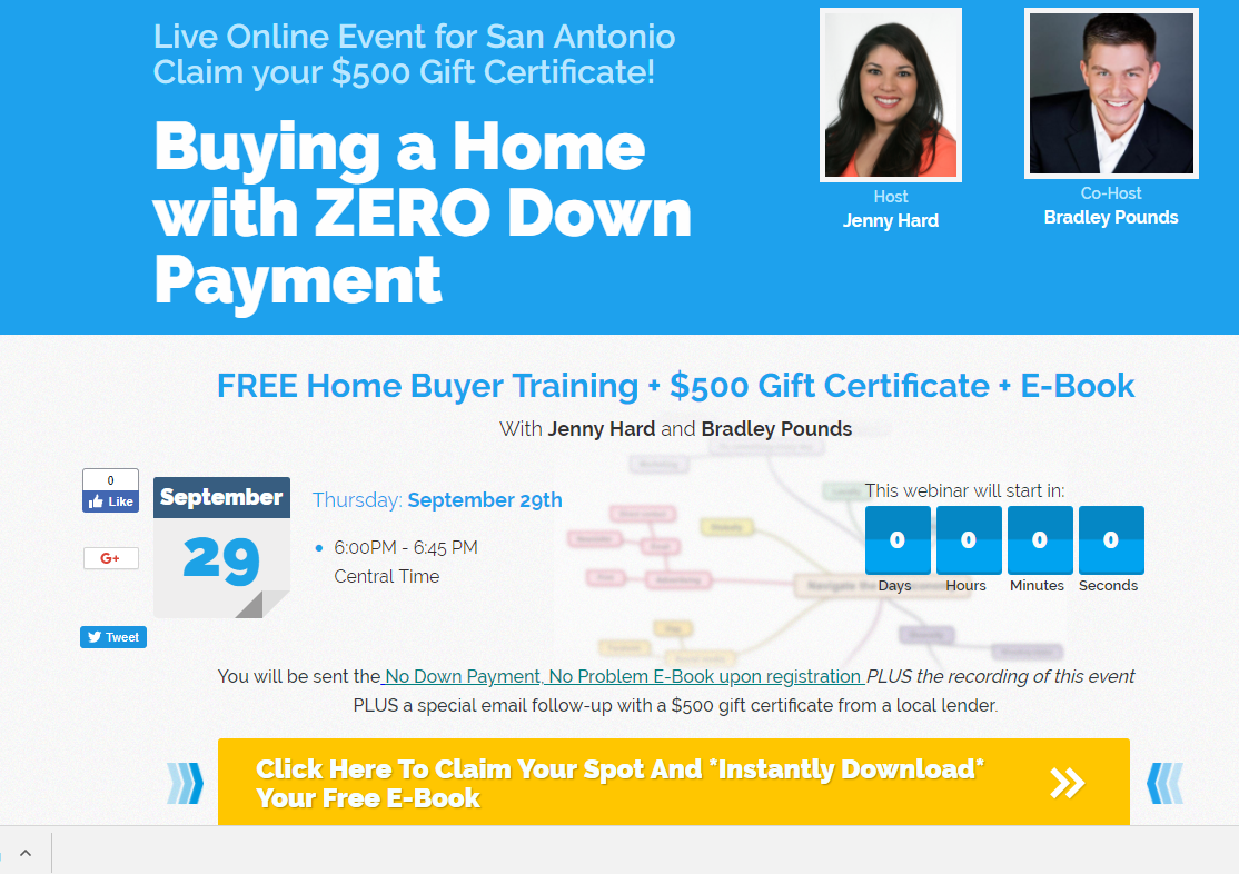
Here's an example of a lead page that uses a countdown clock to instill a sense of urgency about why the prospect should register now.
Lead magnets vary wildly in quality, and you will want to experiment with different types of offers to find the lead magnet that delivers not only healthy numbers of registrations but also registrations from the folks who actually have the ability and willingness to buy your product, use your service, read your content, etc.
Converting the leads
Landing pages usually either have a form inserted right there on the page for the prospects to fill in contact info, or a single button that directs them to a second page that host the form and may have additional text about why the prospect should fill it in.
Another crafty tactic that landing page providers use to snag contact information is a popover contact form. As a prospect, you may find yourself looking at a traditional landing page, only to have a box appear that encourages you (or forces you) to give up your contact info in exchange for continuing to read the page.
Use cases for small and midsize businesses
As a case study, let’s take a look at a few of the uses that our Austin, Texas-based residential real estate brokerage found for landing pages over the course of its eight-year growth arc:
- Coming soon: Placeholder for a newly reserved domain that would go on to become a major property search site with thousands of pages. The landing page served as a way to scoop contact info for early bird visitors to the site.
- Single-property websites: A value add to home sellers is a website with the property address as the actual domain name, i.e. www.123MainStreet.Net (sample URL only.) The domain costs a few bucks to reserve for a year on Godaddy.com and we just point it to the landing page address via a masked forwarder.
- Homebuyer E-book download: Our team leader created an “e-book” consisting of eight pages detailing various first-time homebuyer programs with help from a local mortgage lender. Potential buyers registered to download the e-book, as well as to be added to our email list and began receiving lists of starter homes for sale. We paired this call to action with a very modest Facebook ad spend and created a healthy list of buyers, many of whom visited the site in the middle of the night. The site created leads while we slept, delivering the downloads and adding the leads to the database.
Here’s an example of a very simplified lead capture page from a local lender. There’s a disclaimer below the “fold” (meaning the area of the window visible before scrolling.) but this image you see here fills the browser window before scrolling. Here the graphic element is a photo that’s out of focus at the top, creating a smooth canvas over which the text is laid. Notice that the form is also above the scroll -- very simple and straightforward.

Here’s an example of one of our companies’ landing pages built for a very specific purpose -- recruiting salespeople. Notice that there are actually two calls to action. The team owner has cleverly inserted a request for the prospects to like her business page on Facebook before moving on to the primary action, which is Since we’re using this page for hiring, that’s probably OK. If we were selling widgets, we wouldn’t put an additional ask ahead of the contact form.

Providers and considerations
There is a multitude of providers out there providing great landing page editors, complete with templates and varying degrees of customization. Some things to consider:
- Separate email marketing...: Ok so you’ve got the lead -- now what? Where does it go? Some landing page providers ONLY provide the pages themselves and effectively keep no record of the lead info that comes through your page. That means you need an email marketing suite AND a landing page provider, which may run up the cost but provide the most flexibility and competence on both ends. If that’s your solution, you’ll want to make sure that the integration between the two is robust.
- ...or an All-in-One Suite?: The other solution is to to choose a provider that handles both the page and the email marketing. In that case it’s super important to make sure that you are auditing the platform very thoroughly since it will be challenging to extract yourself from this one-and-done solution that now contains both your content and your database.
- Design control: Do you want to use a simple, proven template with little flexibility or do you want a full-fledged drag and drop or HTML editor? Not sure? Many of these platforms offer free trials, although they may have restricted access or limitations on the number of pages produced, etc.
- Analytics: There’s a landing page provider that has some of the best templates, an easy to use publishing tool and a price that you just can’t beat. (It came free with some other, very expensive software we use from the same vendor.) But we can’t deploy it for anything important. It’s basically useless to us. Why? Because the dashboard is so crappy that it tells us absolutely nothing about behavior on the site, where our traffic is coming from --- basically what is working and what is not --- which is extra horrible seeing as we are giant fans of free stuff.
- Cost: The pricing on these platforms varies wildly, as does the term commitment. Aside from the free trials available, consider starting off with a platform that allows you to pay one month at a time before paying for a full year in advance. Answer the question, am I actually going to make time to use this or is this a fun tech toy for right now?
There are also some very well-written comparisons of each of the services and their pros/cons. Check out these articles for more in-depth reviews:
https://www.crazyegg.com/blog/best-landing-page-service/
https://smallbiztrends.com/2017/01/landing-page-builders.html